
Diagram Libraries for Documentation Part 1: Diagrams
One of the most complicated (and boring) tasks in system documentation is creating flowcharts and diagrams. Manually dragging boxes and arrows is tedious, and there’s no possibility for automation.
In this article, I will discuss Diagrams, a library used to create diagrams via code, which can greatly facilitate and speed up this task.
The Importance of Visual Documentation
Before diving into the specifics of the libraries presented, it is essential to understand why visual documentation is so critical.
Software systems are inherently complex, often involving multiple components, services, databases, and networks that interact in intricate ways. Text-based documentation, while necessary, often fails to capture the full picture or convey the relationships between different parts of a system effectively.
Visual diagrams, on the other hand, can provide a clear overview, highlight dependencies, and make it easier for stakeholders at all levels to understand the architecture, workflows, and processes involved.
Diagrams can serve several purposes, such as:
- Architecture diagrams: Illustrate the high-level design of a system, showing components, services, and their interactions.
- Workflow diagrams: Represent the flow of data or processes within a system, making it easier to understand how different parts work together. Entity-relationship diagrams (ERDs): Visualize database schemas, showing tables, fields, and relationships between entities.
- Network diagrams: Map the physical or logical topology of a network, highlighting connections between servers, routers, and other devices.
Given these diverse use cases, it is clear that visual documentation is an indispensable tool for developers, architects, and other stakeholders. However, creating and maintaining these diagrams can be challenging without the right tools.
Diagrams Library
Overview
The Diagrams library is an open-source Python tool designed to create infrastructure diagrams programmatically. Introduced by Mingrammer, Diagrams aims to help developers visualize cloud architectures, on-premise systems, and other complex infrastructure setups. The library leverages Graphviz, a powerful graph visualization tool, to generate the diagrams. By using Python code, developers can define and render diagrams, making it easy to integrate diagram generation into their existing workflows.
Features
The Diagrams library is particularly well-suited for creating infrastructure diagrams. Some of its key features include:
- Wide range of supported providers: Diagrams supports a vast array of cloud providers, including AWS, Azure, GCP, Kubernetes, and more. This makes it possible to create detailed cloud infrastructure diagrams with minimal effort.
- Customizable nodes and edges: Users can customize the appearance of nodes and edges, allowing for fine-grained control over the visual presentation of diagrams.
- Programmatic approach: Since Diagrams is a Python library, diagrams can be generated dynamically based on code. This is particularly useful for generating up-to-date diagrams as part of CI/CD pipelines.
- Integration with other tools: Diagrams can be integrated with other Python tools, allowing for automation and scaling in complex projects.
Example 1
There are a few setup steps before using the library.
- Install Python, at least version 3.10.
- Download Graphviz from the official site. I prefer to download the ZIP package and manually add the path to the PATH environment variable, but there is also an EXE package for automatic installation.
- In a Python terminal, run the command pip install diagrams to install the library.
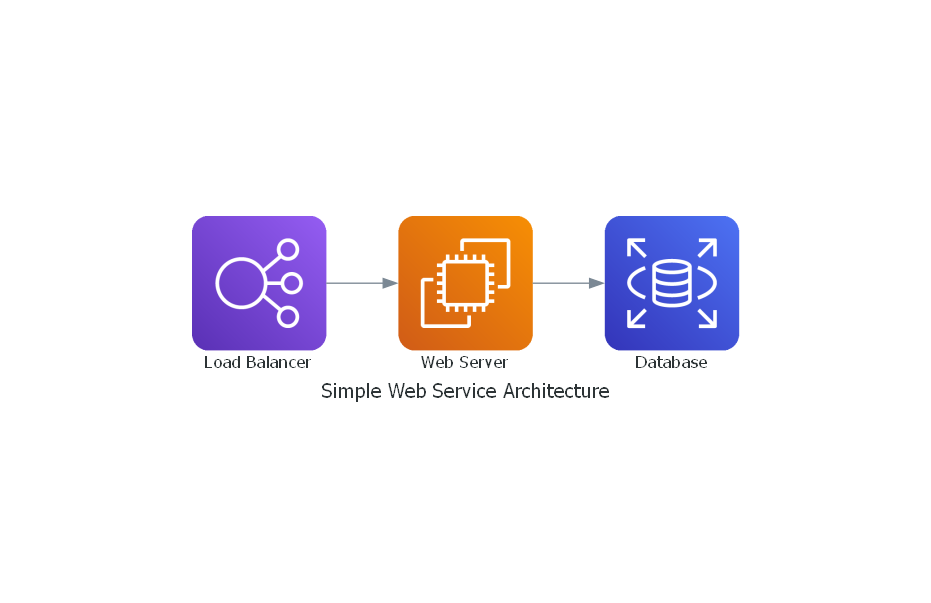
Here is a simple example of how to create a cloud architecture diagram using Diagrams:
from diagrams import Diagram
from diagrams.aws.compute import EC2
from diagrams.aws.database import RDS
from diagrams.aws.network import ELB

with Diagram("Simple Web Service Architecture", show=False):
  ELB("Load Balancer") >> EC2("Web Server") >> RDS("Database")
Save the above snippet to a file, such as test_diagram.py. To generate the diagram, simply run the command python test_diagram.py, and an image will be generated in the same directory as the script.
The generated diagram will look something like this:
Example 2
In this larger example, we will combine some modularization techniques, both creating edges and segregating nodes into groups based on affinity:
from diagrams import Diagram, Edge, Cluster
from diagrams.azure.compute import VMLinux
from diagrams.azure.analytics import EventHubs

from diagrams.onprem.client import Client
from diagrams.programming.framework import React

REST_EDGE_COLOR='blue'
EH_EDGE_COLOR='darkgreen'

def create_rest_edge(label: str):
    return Edge(xlabel=label, color=REST_EDGE_COLOR)

def create_eventhub_edge(label: str):
    return Edge(xlabel=label, color=EH_EDGE_COLOR, style='dashed')

with Diagram("Web Service with Task", show=False):
    with Cluster('Clients'):
        desktop=Client('desktop')
        web=React('web client')

    with Cluster('backend'):
        webserver=VMLinux('app server')
        taskserver=VMLinux('task server')
        eventhub=EventHubs('app.task.processing')

    # Bidirecional connetions, using ">>" and "<<"
    desktop >> create_rest_edge('request') << webserver
    web >> create_rest_edge('request') << webserver

    # Unidirecional connections
    webserver >> create_eventhub_edge('task') >> eventhub
    eventhub >> create_eventhub_edge('task') >> taskserver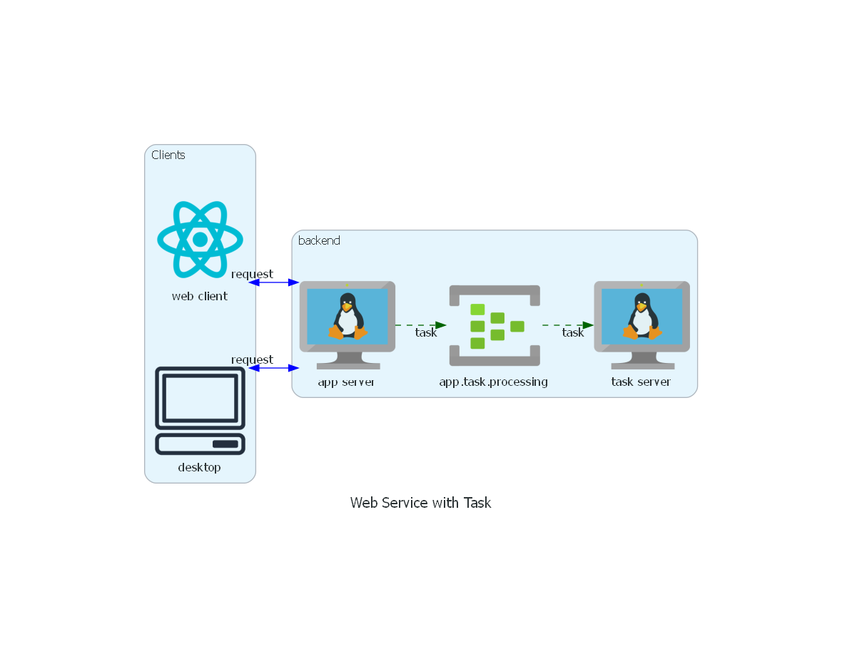
In this diagram, we see that elements can be grouped into Clusters, improving visualization and making the project’s organization clearer.
We also show the types of Azure cloud elements, unlike the previous example with AWS elements. Note also the customization of the lines, with the display of labels and different colors, as well as representing bidirectional connections using "»" and "«" on each side of the line in the code.
This is a small sample of the library’s features. For more information, see the official documentation at https://diagrams.mingrammer.com/.
Benefits
The Diagrams library offers several benefits for creating and maintaining visual documentation:
- Automation: Diagrams can be automatically generated as part of an application’s build process, ensuring that documentation is always up to date. This reduces the risk of outdated diagrams causing confusion or errors.
- Reproducibility: Since diagrams are generated from code, they can be versioned, reviewed, and updated alongside the codebase. This ensures that diagrams evolve with the system.
- Scalability: For large and complex systems, manual diagramming can be time-consuming and error-prone. The programmatic approach of Diagrams allows for the generation of scalable and consistent diagrams, with changes easily persisted through code versioning.
Limitations
While the Diagrams library is powerful, it has some limitations:
- Learning curve: For developers unfamiliar with Python or Graphviz, there may be a learning curve associated with effectively using Diagrams.
- Infrastructure-focused: Diagrams is highly specialized for infrastructure visualization. While this makes it excellent for the intended use cases, it may not be suitable for other types of diagrams, such as flowcharts, sequence diagrams, or ERDs.
- Layout: There are limited ways to adjust and align nodes. In very large diagrams with many connections, the structure can become confusing.
Conclusion
Diagrams is a very versatile and agile library for its intended purpose. Once the initial learning phase is overcome, the speed gained compared to drag-and-drop tools enables tremendous agility in creating and especially updating system structures.
In the second part, we will discuss Mermaid, a library that helps create other types of diagrams more focused on UML, such as sequence diagrams, class diagrams, and others.